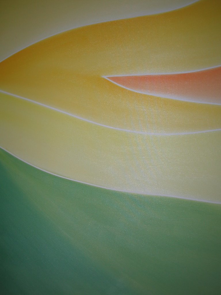
After the last painting, I wanted to do something easy and quick and I wanted to try out that masking technique again.
So, I took an old canvas that had been mostly covered with Lamp Black and then abandoned after the original idea didn't work out, and started laying tape out in lines until I came up with this design.
I thought this one would be fairly simple and be easy to spot, but my wife took one look and said, with complete certainty, that I had painted the Luxor, in Las Vegas. When I explained that it was actually a volcano, she asked if I was sure. Again.
I'm not sure abstracts are my forte. But it was fun and quick and easy to do, occupying a rainy afternoon and I'm mostly pleased with it. What I don't like is that it looks like a background to me. Like I need an animation cell or something in front of it to give it some sort of story or reason for being. I may go back and add to it someday, but for now it's on the wall and out of my head.
I was quite pleased with the way the masking worked out on this one and plan at least two more paintings using the technique, also using acrylics.
Thursday, April 06, 2006

Monday, April 03, 2006
Confetti
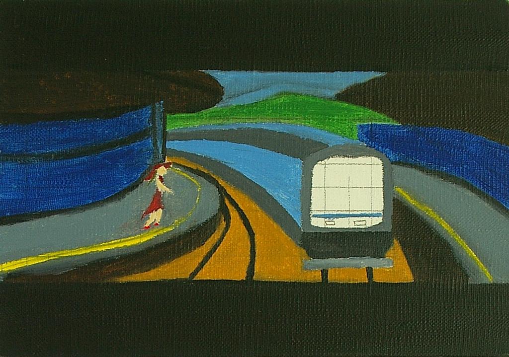
The canvas for N'Orleans had been sitting in the stack waiting to be covered over ever since I got frustrated with my inability to put the image down the way I wanted. However, it managed to sit out of sight for so long that inspiration returned and I was able to get out the oils tonight and lay down two new layers that completely changed the look of the painting and, I think, make it work much better.
I began by adding in the light / street signs as a balancing element and then, completely by accident, I'll admit, I found that I liked the look of the multi-colored daubs around the light and thought that look might work well for the whole painting. So I mixed the colors very lightly on the wood and used a medium flat brush to just gently lay colors on the canvas.
I am fairly pleased with the finished result, although I think the girl in the window needs a lot of work, and am particularly happy with the lamp itself. In my own, ever-so-humble opinion, the overall brightness mixed with sloppy patterns works well and fits the name "confetti" better than it does "N'Orleans", hence the change.
(The streets, for the record, are Bienvielle and Chartern, and are real streets in the city of New Orleans.)
I can see where I've improved on my technique since some other paintings (it's been just over a year since I started painting) but I can also see where I have got a very long way to go. But it feels really good to take an idea I thought I had failed at completely and get something down that I like; something that I think is a bright and positive image that makes for a good representation of how I feel about the city of New Orleans.
(One last note, this is a crappy, crappy photo. I need to take some time and photograph these things properly, but I do not feel like putting in the time needed at close to midnight on a Sunday! Also, for scale, this measures about two feet horizontally by three feet vertically; it is one of the bigger canvases I have tackled thus far.)
Snow
Here’s the latest. This one’s a bit smaller than I have been working with recently. I’m not thrilled with it, but, at the same time, this was the idea in my head. They match. Which is a good thing.
I’ve been feeling pretty frustrated with painting recently and nothing I’ve been trying has been working. I’m not sure what to do or where to go for here. I kinda feel like I lack inspiration at the moment. I want to go outside and paint again someday soon. That might put some fun back into it.

I’ve been feeling pretty frustrated with painting recently and nothing I’ve been trying has been working. I’m not sure what to do or where to go for here. I kinda feel like I lack inspiration at the moment. I want to go outside and paint again someday soon. That might put some fun back into it.
Wednesday, January 04, 2006
Flower Rise
 My wife got home from work shortly after I finished this painting. I rushed her into the room I often use as a studio and asked "What do you think?"
She answered, rather hesitantly, "I like it."
"Great!" I said, "What do you think it is?"
"Hmm. Maybe sunrise or sunset?"
"Oh. Actually, it's a flower."
"Are you sure?"
Which is why I decided to call the painting Flower Rise. Anyway. It's oils on canvas and it's a bigger one, somewhere around 40 centimeters by 50, I think.
Mainly, with this one, I wanted to try one new technique and practice another. I wanted to try using masking tape to create clean, siimple lines and I wanted to do the entire painting with the large brush that I had used for the previous painting. (The brush is shaped like a traditional house-painting brush and has longer bristles bound into a wooden handle. Someday I'll learn what it's called.)
I started by laying a very thin layer of zinc white mixed with linseed oil over the entire canvas. I gave that a day to dry a bit, then used architect's masking tape to create thin pinstripes wherever I wanted to seperate the colors. I used a technique I'd seen used on tv shows about customizing car paint jobs. I took a section of tape and ran it onto the canvas using my fingers to push it into place. Not a very clean technique but effective.
Once I had the tape on the canvas I applied very small amounts of color to the brush using a palette and then brushing it on in long, even strokes, making sure to pull the paint along the canvas, rather than applying tons of paint. I also took pains to pull the paint down from the edges of the tape so that all the colors are darker along the tops and lighter along the bottoms of their respective areas.
This painting was a bit of a departure for me as I had no reference photo or sketch and no clear idea of what I wanted before I began. I only knew that I wanted a white base, light colors and masked off lines.
I'm pretty pleased with the way this one turned out. I'm sure I'll be using the masking tape technique many more times as well as sticking with the large brush. Right now I'm very tempted to re-do "Bugs" and "Norwegian Wood" using these techniques. We'll have to see if this feeling holds or if I decide to go with something new.
Thursday, December 22, 2005
The 1:15 to Omiya

This was actually intended to be just the background of a much more detailed painting but I really liked the colors. And that I could call it done and no one could really argue with me. I had the idea ages ago and did a small painting that didn't really work for me. This one, which is obviously much more impressionistic, I think works much better. At least, I think that for now. We'll see how I feel next weekend after I've had to walk around the wet painting in my office for a week or so...
Mainly though, I just really wanted to paint something and I wanted to do it fast. I've got ideas for long paintings, stuff that's going to require sketches and research and whatnot and I'm looking forward to doing them. But I hadn't painted anything since October and I just wanted to get my hands wet, so to speak. It felt good, I'm glad I did it and I now feel much more ready to go on and do some other paintings over the holidays. Probably smaller paintings too.
This is the largest canvas I've ever worked on; it's two feet by two and a half feet wide. (They were having a sale at the art supply store. I had cash in my wallet. Thus does life happen.) It's oils on canvas and done mainly with a wide brush that looks much more like something you'd use to paint a wall, not to make a painting but, yeah, well, learn something new every day, right?
Cross-posted from Left From Seattle.
Saturday, October 29, 2005
Norwegian Wood

Here's the finished painting. There are parts that could be done better, but for a first attempt at a face, I think it came out pretty well. The colors work better in real life than on the web but I like how all the main colors are formed from some combination of red, black, and white.
I'm even happy with the mouth and nose, although, in the interest of accuracy, I should mention that the mouth was painted over 4 times trying to get it right and the nose took the better part of the week and was re-done several times as well.
This one was done in acrylics, which was nice in that the paint dried very quickly and was easy to paint over and to build layers with. At the same time, oils are so much nicer to work with. The way they blend so easily and are so thick on the canvas is really nice. All in all there are points in favor of both oils and acrylics and I feel comfortable using them both now so I guess it'll depend on the image I have in mind which determines which kind of paint I end up using on the next painting.
The last note for this painting is that it's on the smallish side. It's A4 size on the standardized metric scale.
Cross-posted from Left From Seattle.
Saturday, October 08, 2005
Power Lines

This was a quick one, done mainly to experiment with using Linseed Oil. LO is meant to make the finished product shiny, as well as make it easier to blend surface layers with the undercoat.
So, I started by painting the entire canvas with Zinc White. ZW makes the surface color really pop out; I put the white down with a palette knife, then used a fan brush to blend in the oil. I gave that a day or so to set and then used the fan brush again to lay down splotches of blue that I blended into the mixed blues on the canvas.
I got up this morning and added in the towers and power lines. M wasn't too happy with those but I thought they worked pretty well. Mainly though, I really like the background as it worked exactly how I'd hoped, getting that bright, shiny blue to come out over the white was nice.
Oh, and this one is based on another of my photos. The photo is on 91 Days, but I'm leaving it to you all to find out which one.
Tuesday, October 04, 2005
Bugs (Unfinished)
The current work in progress, Bugs was shelved due to a lack of time to work on it, and now, frankly, I want to move on to the next painting and don't know if I'll get back to work on this one.
Bugs was a radical departure from my previous paintings, and intentionally so. I found the work of an artist named Coop, who'd posted his process on his website Positive Ape, and I decided to try to follow his style.
I didn't quite get there, but I learned a lot about layering and colors by doing this one.
Algernon

This painting actually has nothing to do with the book. I was attempting to be clever. Anyway.
Algernon was another attempt at a brushless painting. Since I had spent so much time on the background with Boots, I decided to do a plain background and work on the forground images more. I added a very short, round knife to my collection and used it to make the flowers and leaves.
I really like the finished colors in this one; unfortunately, they don't transfer to the web all that well.
Torn-up Old Boots

Boots is probably my most popular (amongst family and friends) painting to date. I'm very pleased with this one, as it's the first time I managed to make oils do exactly what I wanted.
I set out to try doing a brushless painting. I used two palette knives, a long skinny one and a shorter, broader one. The background was made by putting the paint directly on the canvas and using the knives to blend the colors together. The boots were painted by using the shorter knife like a brush, mixing colors on the palette and applying the paint in forms.
It worked fairly well, I think.
Going Away Again (Unfinished)
Going Away Again was conceived as an attempt at both painting from a photo and an attempt at an Art Deco style. The first went rather well, the second, not so well.
I did a grid transfer of the photo elements to the canvas and sketched in some details. However, when I began painging things in, I found that I was unable to control the paints well enough to get the clean, crisp lines found in Art Deco works. I eventually became so unhappy with it that I put it to one side and have never gotten around to finishing it.
I think I'll probably use the same idea on a much larger canvas, but work with acrylics and use tape to mask off the lines I want.
Hanami
Hanami was painted on the road. Well, in a park actually. I went with some friends to a park in a nearby city to have a look at the cherry blossom trees while they were in bloom last April.
I'm not thrilled with the finished product, but I'm not displeased either. This painting was an attempt to paint what I could see in front of me as all the previous paintings had been directly from my imagination. Even then, I ended up using visable elements and putting them into a non-existant composition.
I tried a few new brush work techniques on this one, namely using blotting to paint in the flowers on the trees. It worked, but not as I'd expected. Again, I wasn't used to the difference in viscosity between oils and acrylics and had expected to be able to put on thin layers of pink and white. The oils, however, left much thicker daubs of paint on the canvas and pulled more paint to the canvas from the brush, leaving me with more paint and less of a blend than I had hoped for.
Beautiful day to be in the park though.
Starry Palm

Starry Palm was my first attempt at using oils. I'm not quite sure what to think of this one. It doesn't match the image in my head because there was no image in my head. I had just wanted to try using oil paints; to begin getting a feel for how they were different from acrylics and how the brushes worked differently with different materials.
I still like the idea, and I like the lower part of the painting better. The top was too rushed. I was very unsure of what I was doing and wasn't aware of how the oils would blend on the canvas. On the lower half of the painting I was much more concious of how the different colors would blend and interact and figured out a few brush work techniques to keep them seperated.
Dire Straits

The title for this one comes directly from Douglas Adams' "So Long, and Thanks for all the Fish". Just imagine Arthur and Trillian somewhere behind the clouds.
Anyway, this started as an attempt to paint the ocean and ended as a flight (erhm, uh, sorry) of fancy. I had painted the sky and felt that it needed something to help fill it up so I started by painting seagulls, then added long, lizard-like tails and eventually ended up with dragons. Which prompted the Douglas Adams memory which made me laugh and so on and so forth.
The only thing I'd like to re-do in this one is the lack of depth. The sky is very flat and the lighthouse sits exactly on the horizon, two things I'll change if I ever attempt this scene again.
The Temple of the Dancing Monks

Yeah, I don't really like this one. The image on canvas bears very little relation to the idea in my head; this was an attempt on my part to paint trees and people. Neither came out very well. I'm really unhappy with the monks themselves. I didn't have the technique or finger dexterity to accomplish what I'd been hoping for.
However, I am pleased with the temple pagoda in the background. I was trying for an aesthetic where the background is a solid color and details are added not through lots of colors and shading but rather through a single brush stroke or two that implies a detail rather than actually shows it. I think I accomplished that in the sky and temple, just not the trees or people.
But, as I've said, it is a learning process and I feel that it's important to represent the good with the bad. Win some, lose some.
Lazy Moon

My second painting, Lazy Moon, is one of the ones I'm most proud of. It's one of the very few that has turned out exactly the way I wanted it.
I had set out to try layering with acrylics on the canvas. The three main areas of the picture, the moon, the sky and the sea all have several layers and actually stand off of the actual canvas a bit.
I was especially pleased with the way the layers of the sea turned out and how the reflection of the moon is easily discerned.
Storm Coming Down the Mountain
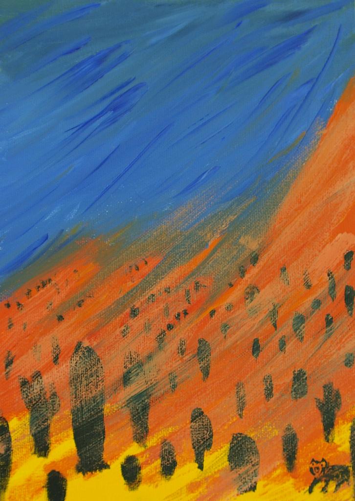
This was the first painting I did. Well. Not ever, but the first since I was a child.
My good friends CN & MQ were getting together for a paiting session and I wanted to go and had just planned to hang out and maybe take a few photos. On the way to CN's apartment, I passed by the 100 yen shop and remembered that they had lots of paints and brushes and whatnot, all for 100 yen a shot. So I grabbed some basic colors, a couple of canvasas and a couple of brushes and off to CN's house.
Got there and got set up and found that not only did I really enjoy the painting process, I was actually able to put onto the canvas what I'd held in my head.
This first painting was an attempt at the Arizona mountains during a storm. I conciously tried to use the colors of the Arizona flag...no I didn't. I'm just yanking your chain. The colors were just storm and desert colors and just happened to match the flag. Still. Sounds like I know what I'm doing, huh?
I'm pretty proud of the little bear down in the corner. That came out well I thought.
About
Hey.
If you're reading this, I'm assuming you either know me, and are curious, or, don't know me and are interested in painting.
So, just to make sure the record is clear, I'm the Mighty Toad. Obviously that's not my real name, but it's the easiest way to find me on the interwebnets. I started painting in January of 2005. I started painting 'cause many of my friends are quite talented and often get together to paint; I hate to be left out.
I optioned to start this seperate blog as a way of keeping track of my paintings, and, with any luck, a record of my development as a painter. I'm working in oils and acrylics, on pre-stretched canvasas that I buy from the store.
I have no idea what I'm doing, but I love the learning process. I hope you enjoy the paintings.
Sincerely,
Toad
Subscribe to:
Posts (Atom)